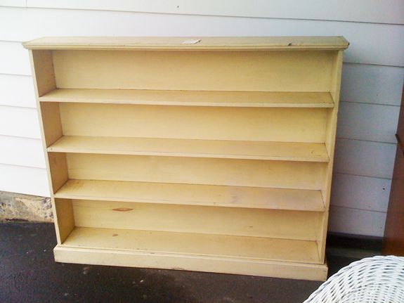
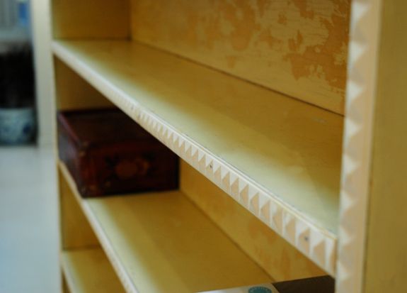
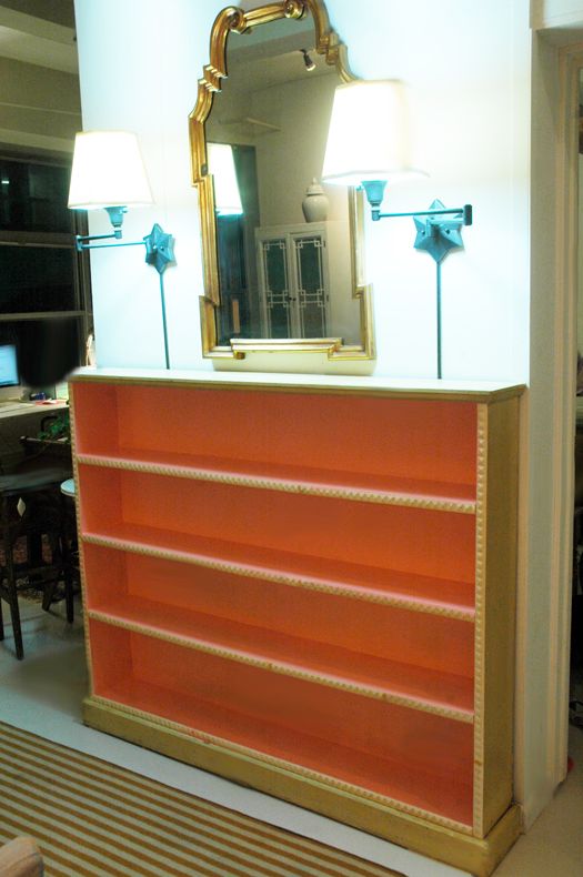
Then I added stud-shaped moulding from Michaels. Subtle, but a cool discovery if you're looking close. (And isn't that what home decor is all about? I love little surprises.)

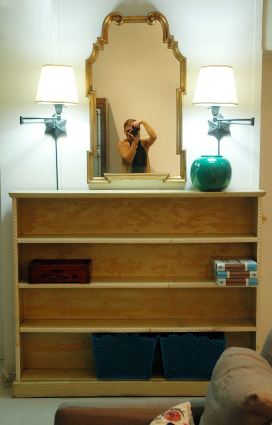
So when it came to choosing a paint color for this piece, I went back and forth a lot. I almost did a soft blue gray color so it would be less of a presence in the space. But I decided to try the crazy color combo first and save the blue gray idea as a back up plan. I'm really glad I didn't do the blue gray because I ended up painting the fretwork cabinets pale blue (they were white at the time) and I'm really happy with that color there.
So what crazy colors did I go with? My mom was in town visiting at the time and she suggested coral pink for the inside (genius that she is).
I picked up a quart of Benjamin Moore's Mixed Fruit (2011-50) in semi-gloss and my sweet mom did all the painting for me. Here's the first coat:
So what crazy colors did I go with? My mom was in town visiting at the time and she suggested coral pink for the inside (genius that she is).
I picked up a quart of Benjamin Moore's Mixed Fruit (2011-50) in semi-gloss and my sweet mom did all the painting for me. Here's the first coat:
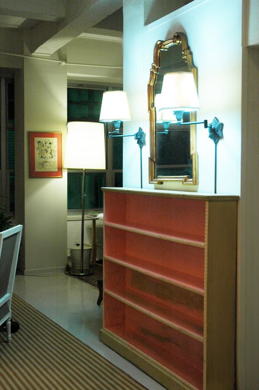
And then the second coat. We're thinking, okay, looking pretty good, but we'll see...
You can see in this real estate listing photo that our kitchen is all black, which I actually really like. When your kitchen is front and center, it's best for the appliances and cabinets to sort of fade away. I wanted to carry some of that black over to the living room. We thought it would be nice to frame out the shelves in black and then do the coral on the inside.
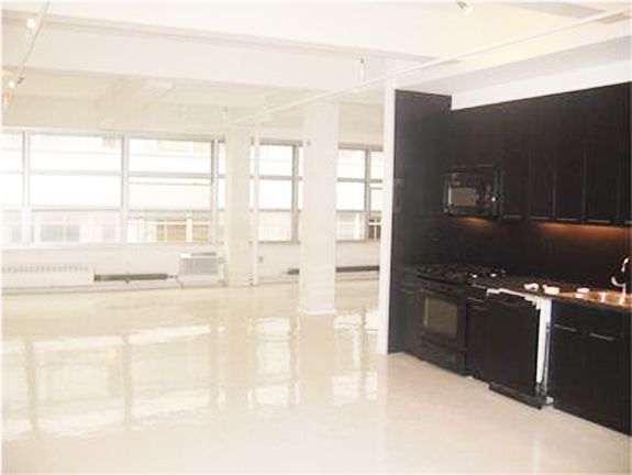
In case you're confused by this picture, we added temporary walls to split up the space into bedrooms. This is how the loft looked when we moved in. The door to the girls' room and the bookshelf is directly to the left of the stove area, only set back a couple feet.
We put that first coat of hi gloss black paint on the shelves and we knew we had made a good choice.
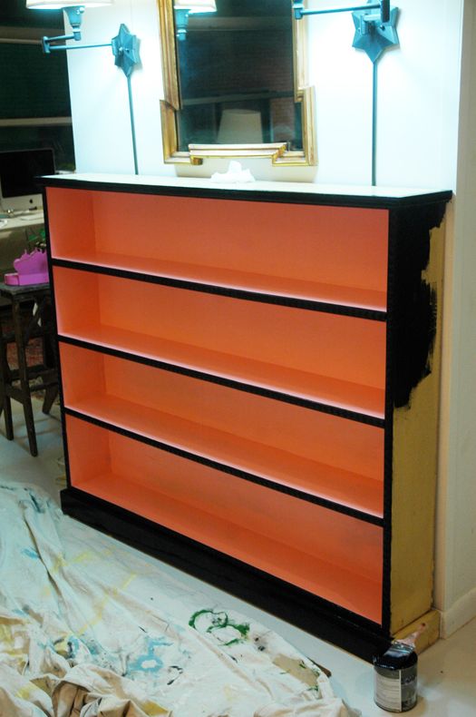
I love the contrast.

The orangey coral feels so Dorothy Draper/Greenbrier to me. You'll die when you see how great it looks with the black kitchen (and my new persian rug!!). I'm wrapping up the kitchen island project and then I'll share photos.
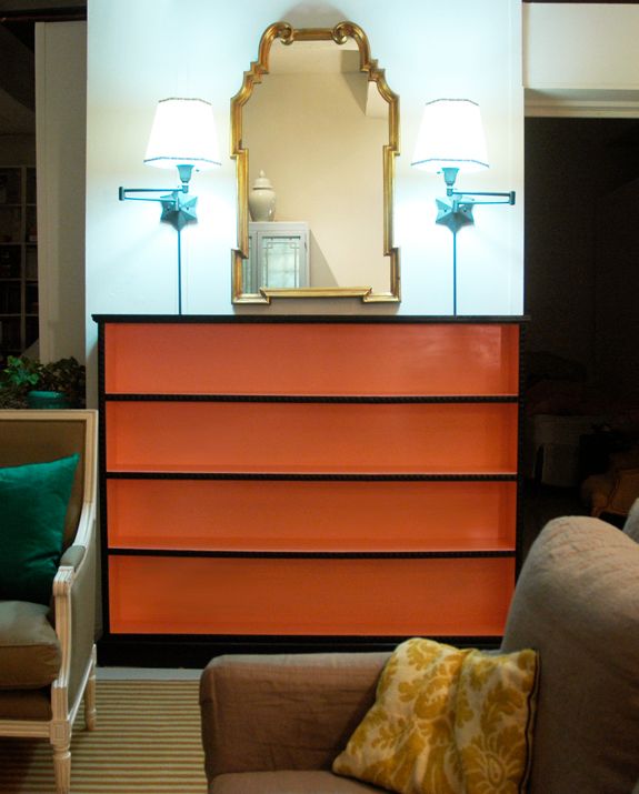
P.S. If you look close here you can see I added some little white and black mini-floral trim to the shades. Such an easy fix that made me like the shades 1000x more. Still moving them to make way for my GG sconces though! :)
