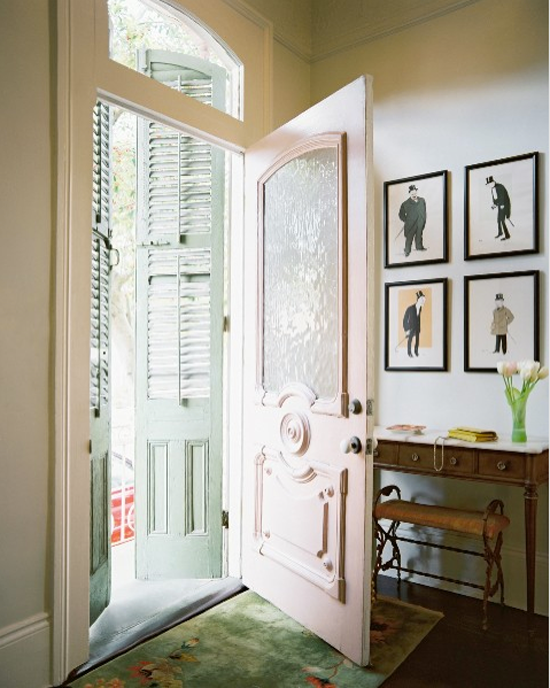
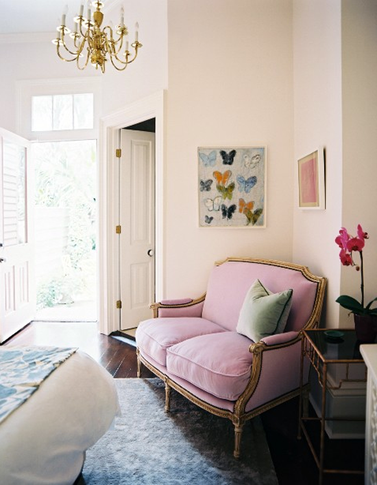
We all know I like to use color in decorating, but I also think there should be balance of neutral tones and also plenty of vintage/antique pieces. When everything is new and matchy-matchy, the color becomes garish and tacky. These guys nailed it. I mean, check out that pink door! Amazing.
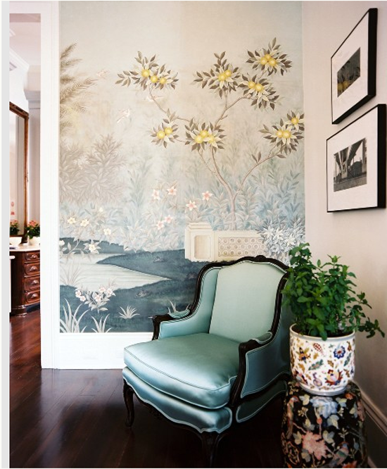
I love Zuber hand-painted wallpapers so much. And I wish I could copy the garden stool with ginger jar planter idea but that would get knocked over in about eight seconds in my house! :) Maybe I could epoxy them together??
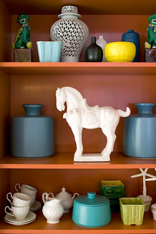
This shot is from an interior of an armoire. Love the orange.
One of the only times I've liked furniture on the diagonal! Purple perfection.
Who needs big box store decor when there are vintage beauties all around to be had? Let's make our homes interesting and unique.
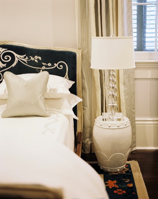
What is happening on this headboard here? Custom embroidery maybe? Or maybe a found textile made into a headboard? I looooove it!
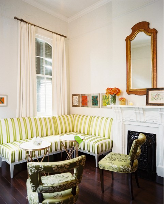
Custom banquettes verging on mini-sectionals are such a great solution for townhouses.
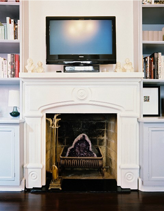
Holy geode in the fireplace! SO COOL! And I am definitely going to copy them and start a little collection of busts.
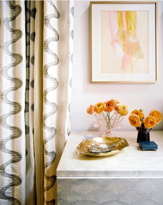
This shot gives me heart palpitations. Those DRAPES. The artwork!!! And whatever's going on with that console table. The color and pattern play is genius.
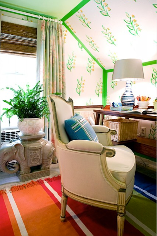
I'm feeling like this room must be done with stencils and that the border is just paint. I really love it. That rug is really cool too. Such a good reminder that if every piece in a room is beautiful on it's own, the whole look will be amazing together regardless if the colors match - it's the collected look.