FREE DOWNLOAD PICTURE
MORE INFO ABOUT NOTEBOOK
Showing posts with label Art. Show all posts

Thursday, March 28, 2013

Another Lady Portrait

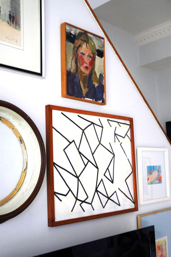
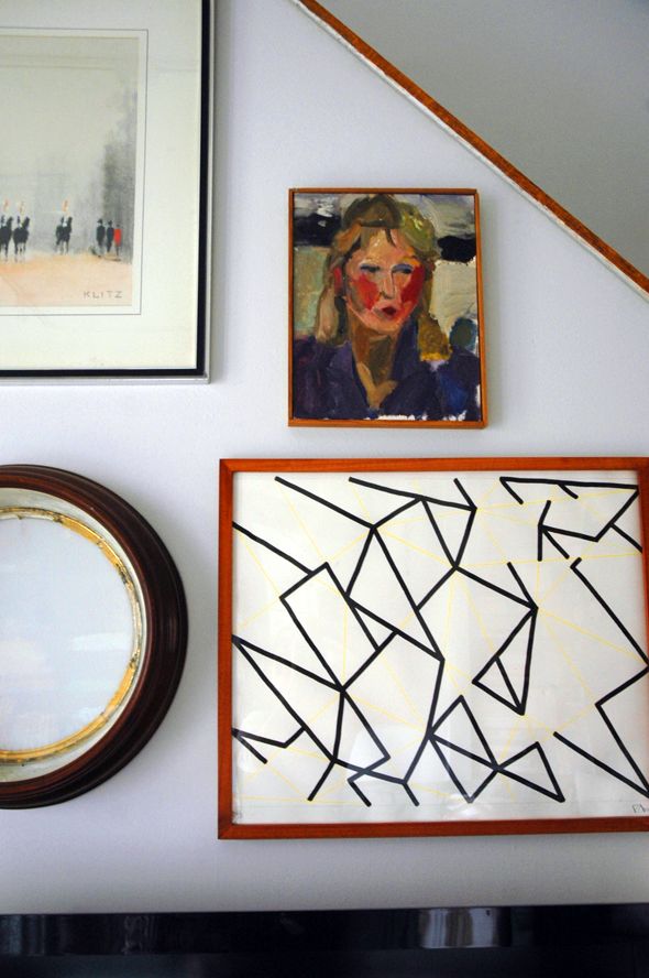
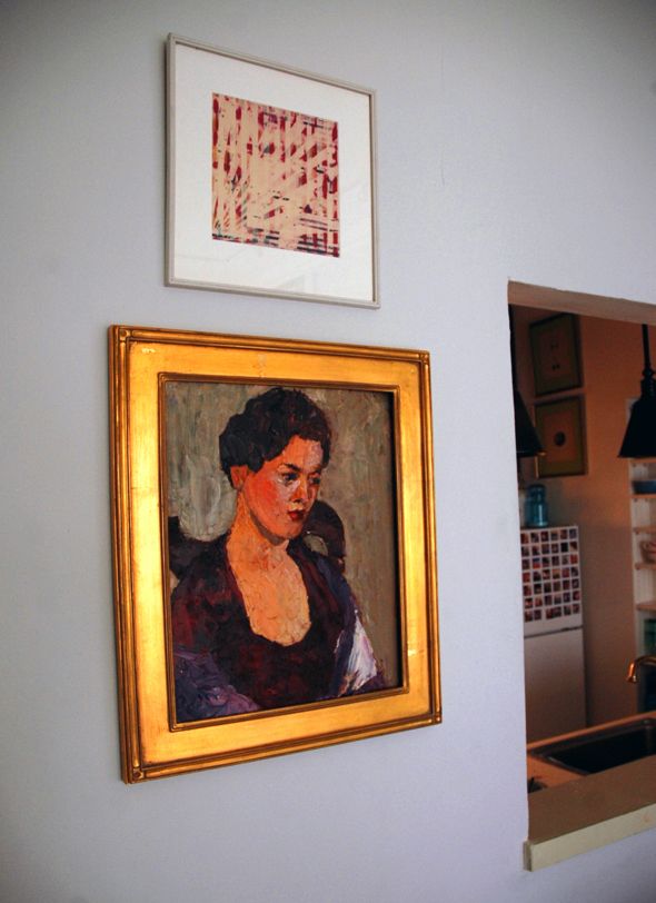
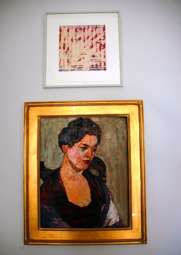
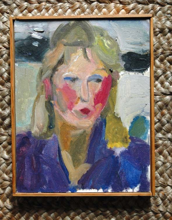
Art is definitely one of those subjective things. Something that speaks to me might not be your bag. When I brought home this portrait from the flea market a few months ago, Heather was not a big fan (I think she likes it more now). I love it though. I'm fascinated by more abstract portraiture and I love the colors of this one.

 photo DSC_0349.jpg

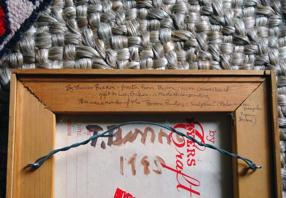
The vendor who sold me this painting had a lot of pieces from the estate of a Connecticut artist named Lucy Baker. This portrait though was not one of her works, but was a trade from one of her artist friends, Thomas Barron. He wrote a little note saying so on the back.

 photo DSC_0336.jpg

 photo DSC_0369-1.jpg

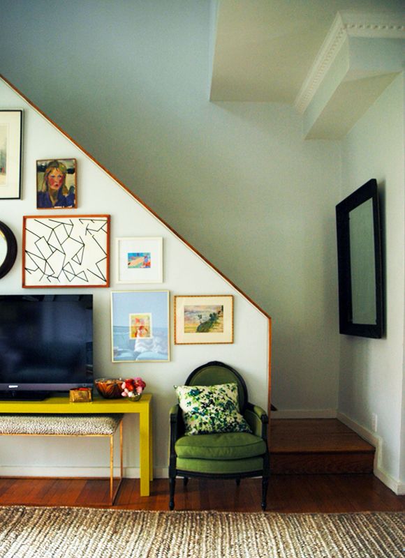
I had her hanging in our bedroom for a while and I think I preferred her in there. But the electric grape color of her shirt just looks so pretty with the chartreuse console table, it seemed a shame to keep her hidden away, even though there's a much grander dame in the room already. :)

 photo LGNConsoleTable3.jpg

 photo DSC_0360-1.jpg

Oh! And by the way, I went back to Home Depot this week to find out the paint color of the console. It's "Citronette" from the Home Decorator's Collection line from BEHR.

Monday, March 25, 2013

New Art in the Living Room

 photo DSC_0392.jpg

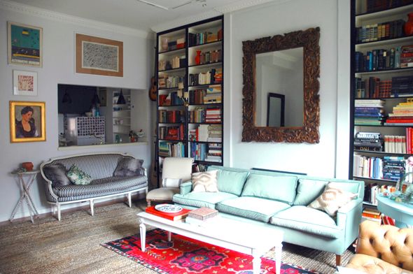
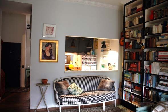
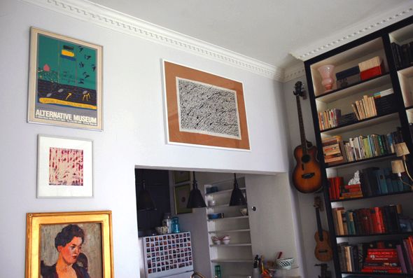
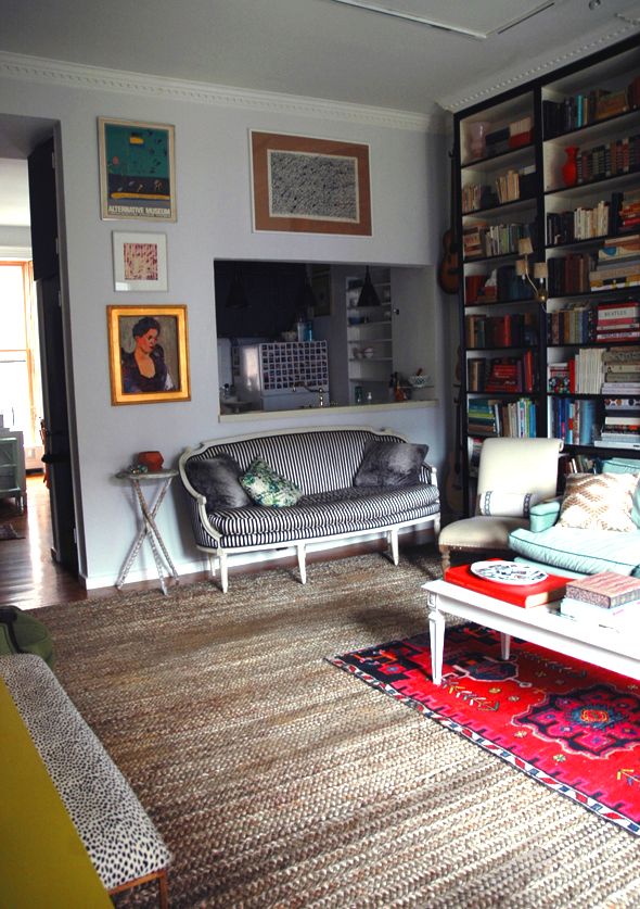
Over the weekend I hung up some more art in the living room. I had left the wall shared with the kitchen pretty uncovered up until now because there's a gallery wall in the room already and I didn't want to overpower the space. But mostly the lady portrait painting and an abstract photographic print I had hung up for a few months just felt lonely and too sparse to me. Here's the  before shot:

 photo DSC_0226.jpg

 photo DSC_0263-1.jpg

 photo DSC_0254.jpg

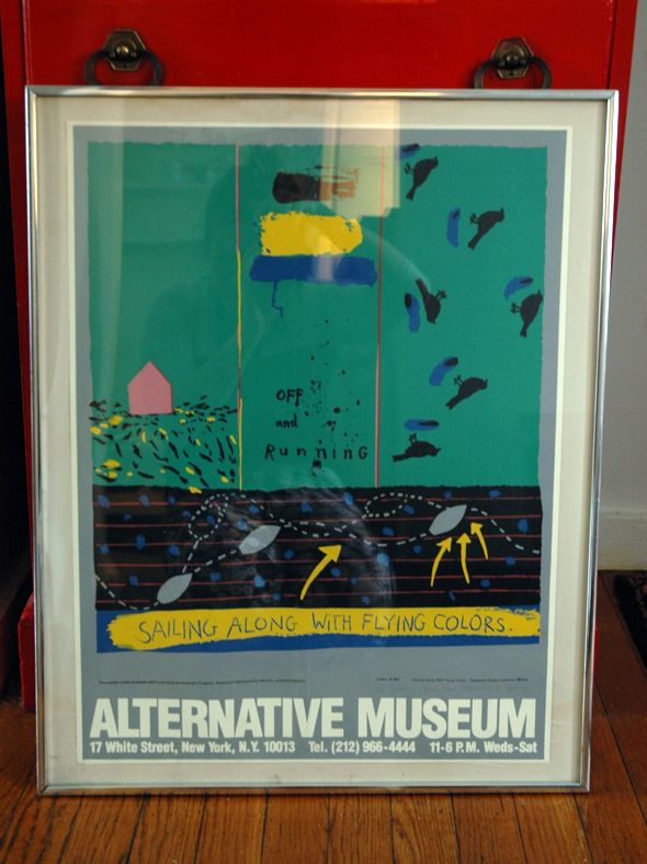
I had a meeting with Bloglovin' on Friday morning at Cafeteria, which is right by my favorite Housing Works location. So if course I had to pop in just to see what they had, and there was a treasure trove that day! Thrift stores in NYC are usually not so fruitful and they are really ridiculously expensive, but some times you can luck out. One of the things I brought home was this exhibition print. I fell in love with the shade of green from across the store and was so glad to see the print was only $15.

 photo DSC_0243.jpg

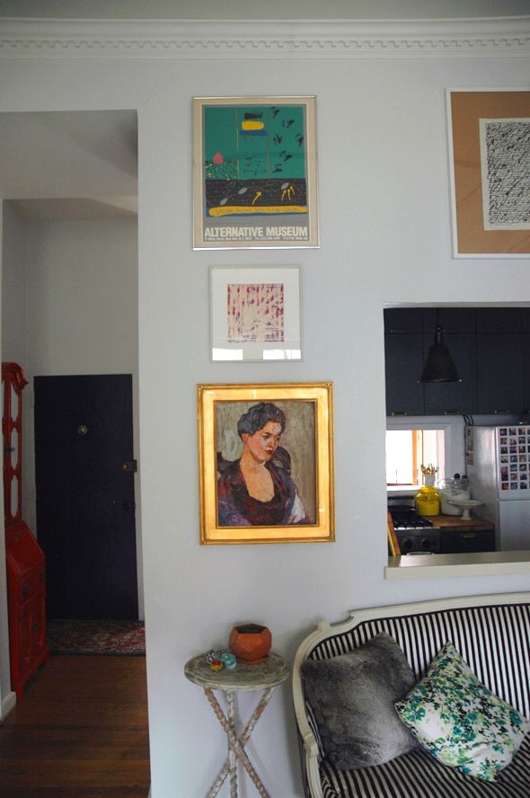
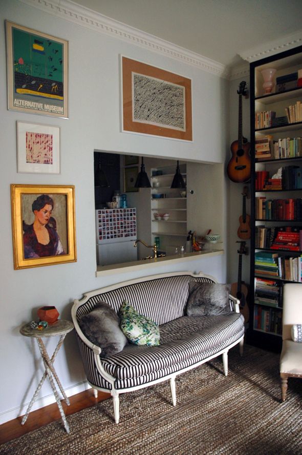
I had been wanting to add something in this tone to the walls to pick up on the color of the green sofa, so this was a happy find. I hung it up almost all the way up to the moulding and put back up the lady and the photo print right below the new print. 

 photo DSC_0315-1.jpg

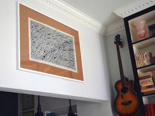
I also hung a piece of art I bought a couple years ago at the flea. I talked more about it here, but a lot of times you can find vendors who have purchased a deceased artist's entire estate. It's a good time to buy up a few pieces of an artist you like for almost nothing. I bought a lot from this artist's estate. This one was a rice paper and ink drawing called "If Not Sound, Then, Music is Feeling."

 photo DSC_0381.jpg

Right next to Michael's guitars felt like a good place to hang it.

 photo DSC_0304-1.jpg

I like how the four pieces play off each other. And I'm happy with how the kitchen pass-through is less of a focus on that wall now.

 photo DSC_0296.jpg

 photo DSC_0392.jpg

We're getting there! Slowly but surely the bargains are finding their way to me :)

 photo 5DSC_0292.jpg

Monday, February 25, 2013

Swan Prints

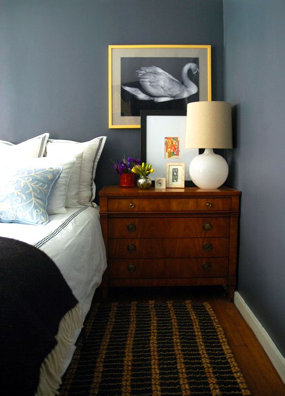
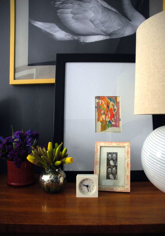
Our bedroom is starting to come together. I guess really all I have left is to figure out a headboard (that's why we have an extra row of pillows stacked on our bed - something soft to rest our backs on for the time being!) and maybe a little art project for the long wall to the right here. There's also a chair on the other side of the room that could probably use new upholstery. But for now we're enjoying our recently purchased bedside chests, lamps and rug (on super-sale!). The DIY roman shades are working beautifully (still enamored with the tumbling block tape trim!) and the art has been hung. I'm happy with both the vintage oil painting on the window side of the bed and the swan print on the right side:
   
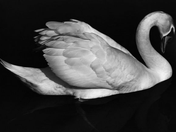
Remember this post? I ended up buying the swan print thinking it was going to make it up in the gallery wall in our living room, but somehow it fit our bedroom vibe better. It's a little funny how much I love swan photography because I'm actually not the hugest fan of birds in real life (I swear the pigeons can sense my distain and they seek me out). But swans! Aren't they just hauntingly beautiful? And I think they photograph so well, sort of in the same way horses do.

I layered the swan print with a small abstract pastel (that looks so blah here in these photos - promise it's a great little piece in person). I bought it at the flea market a couple years ago and completely forgot about it. When I was looking in the basement for a frame for the swan, it resurfaced, and I think the two pieces were meant to be paired. I like how they work together in the space since I wanted a contained amount of color in here (this green Brunschwig wallpaper and bright blue door are in the hall just outside our room).


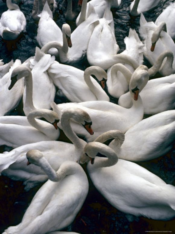
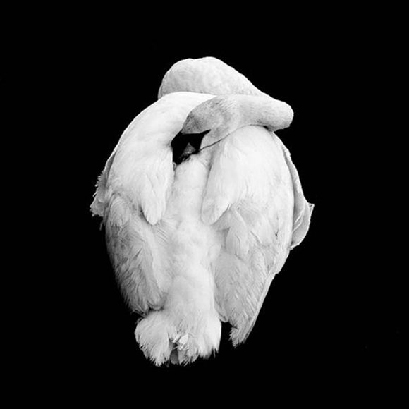
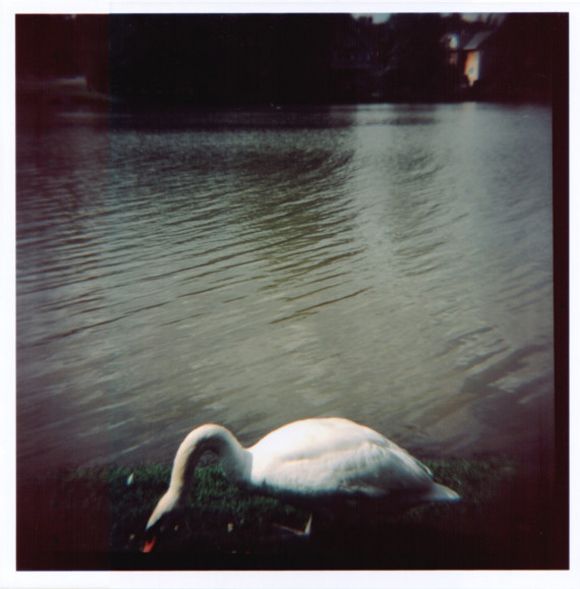
Here are a few other swan prints that I'm loving, in case you're in the market yourself:

Patrick Cline used to sell these polaroid prints in an etsy shop, but the shop was taken down recently. (Might be worth reaching out to him to see if he has any of the limited edition prints left?)


If Patrick doesn't, this print is sort of cool, too (and is super affordable).


This $10 print is simple and juvenile in the best way possible.

How was your weekend? It felt a little like spring yesterday here in New York. Everyone was out walking their dogs and playing with their kids, and smiling and brunching and buying flowers. The general enthusiasm on the street was pretty contagious and it made me suddenly remember how much we really do like living here. (side eye over to you, Winter.)

Monday, February 11, 2013

Moth Prints

Pssst - Thank you again for your support with the Homies! We made it to the final round in two categories (hooray!) and the voting has started over again. If you have a minute to pop over and vote for LGN as best home design blog and/or best DIY blog, it would mean the world to me. Thank you so, so much! xo

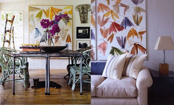
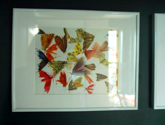
Years ago, Anna Spiro wrote about the Australian artist Allyson Reynolds and her beautiful paintings of colorful moths. Pretty much everyone went bonkers for them and the large paintings were completely unattainable. I've since heard one of the galleries there in Australia occasionally has one or two up for sale (in case you're in the market).


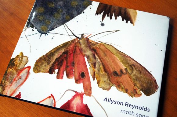
Recently I happened to stumble across her book called Moth Song that the artist sells through Blurb.


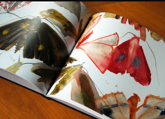
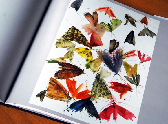
It's pricey at almost $100 with shipping and taxes, etc, but there are pages and pages of beautiful images that I think are completely frame-worthy.


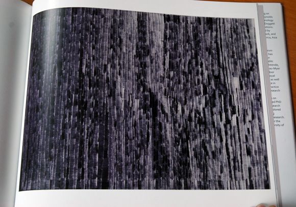
About half the book is moths and half is this series of black and white images. I love these too and hope to use them somewhere. The patterns are all different and would look so pretty in a series in a hallway or maybe a powder bath?


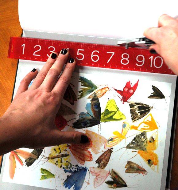
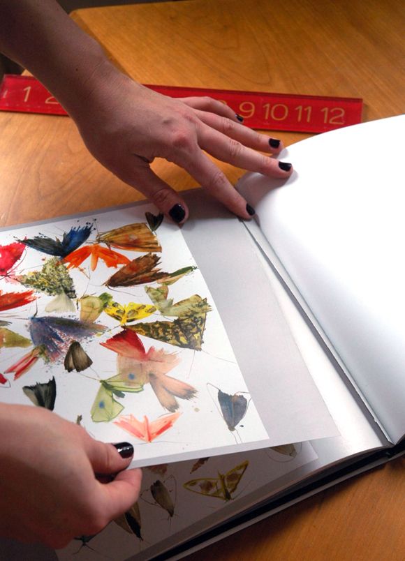
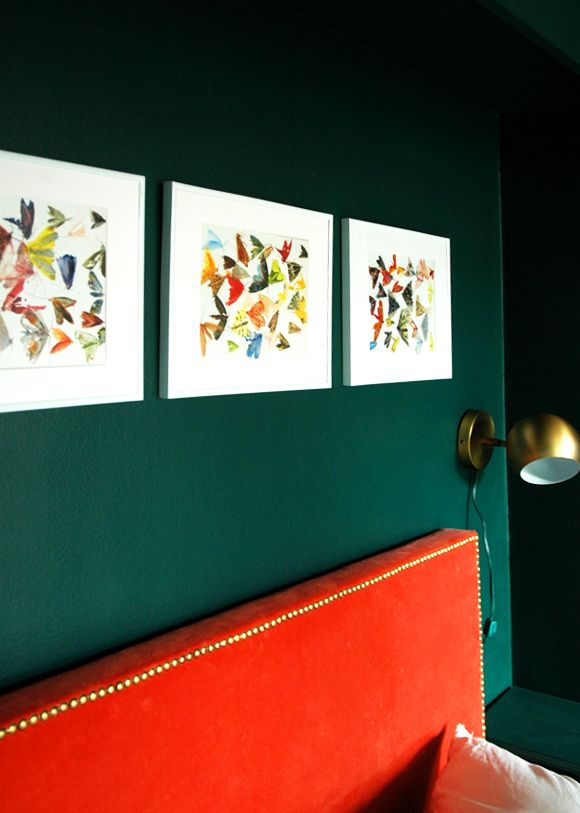
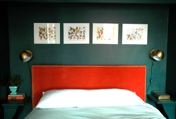
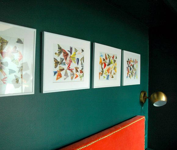
There are probably a dozen or more moths prints in the book and I knew I wanted to use four in Heather's room. I just used a utility knife and a ruler to carefully cut out the pages I wanted. 


This way, the book is still (mostly) in tact and the other pages can still be enjoyed without it being obvious that a few were torn out.


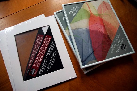
I picked up my trusty two-pack of frames at Michaels for about $7 and a couple of simple white mats to frame the four "prints".


They're not fancy frames obviously, but I really love how simple the white on white look is with all the crazy colors and the movement in the prints.


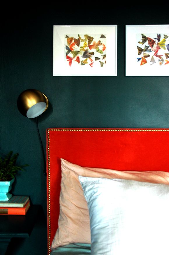
Heather loves the prints as much as I do. Aren't all those bright colors pretty on the dark green walls?


And I also like how they pair with the new (super affordable) wall-mount sconces I bought at Urban Outfitters. I decided to paint out the white cords with the wall color paint, just so everything not meant to be noticed sort of fades into the background of the wall (along with the corbel nightstands and the light switch plate).


Now I just need to pick a fabric for her shams so I can photograph the rest of the room.  I am dying to show you the giant art just to the right of this shot above! (eeps! so excited!)
Thursday, February 7, 2013

Two's a Collection

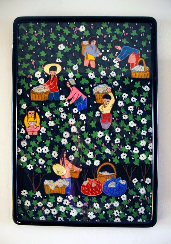
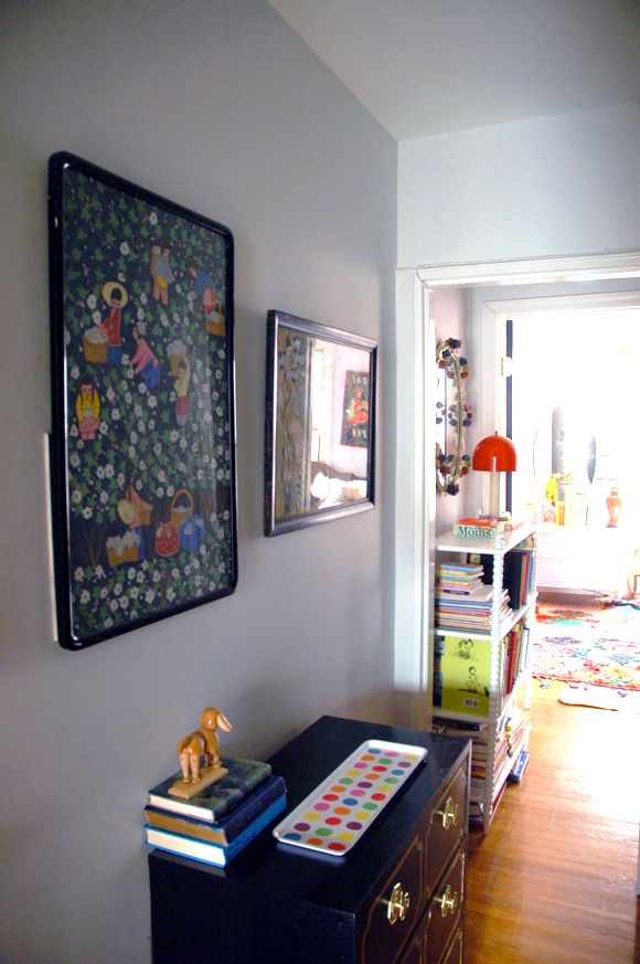
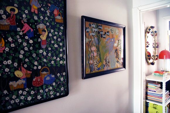
I found this vintage gouache painting a year or two ago at an antique store called Granny's Attic in New Jersey (the same trip I picked up those bergeres that I did an upholstery series on).


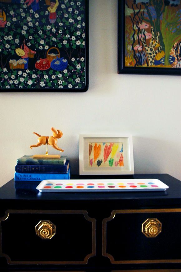
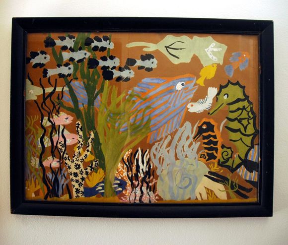
I wanted to hang it in or around the girls room, but it just always felt lonely or something (can art look lonely??), so it stayed tucked up on a shelf for a while. Until I found another vintage gouache at the flea market. This one is by a different artist, and obviously the subject matter is completely different (fish!), but I LOVE how they work together. Harmony in the busy-ness of the patterns.


They are living in the hallway right in front of the girls' bathroom/bedroom. I think it's fun for the art to get a little more child-like in the common areas where the kids spend a lot of time.


Evie calls the fish painting her "Quardium" (aquarium). Sad and cute :)


Thanks again for your vote in the Homies!

Tuesday, January 29, 2013

More Framed (Faux) Butterflies

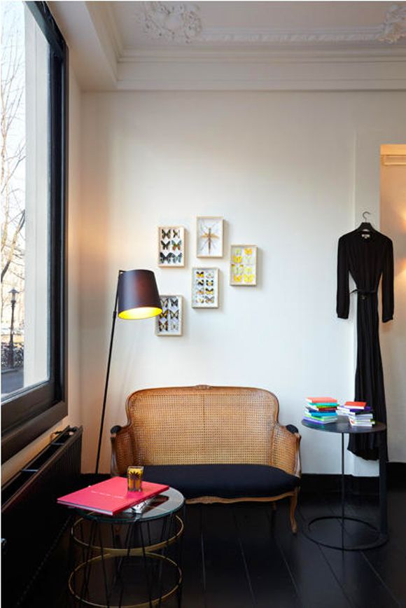
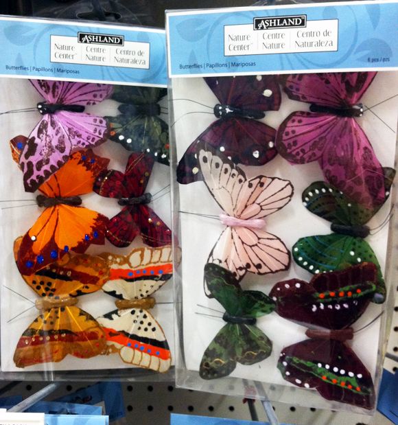
I'm still in love with framed butterfly collections. Some of you were creeped out by the idea (and I suggested this paper cuts version), but I still like something a little more real-looking.


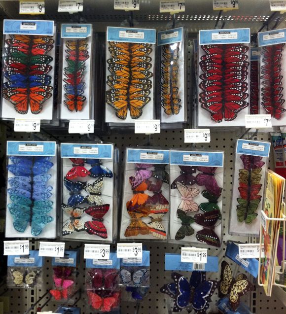
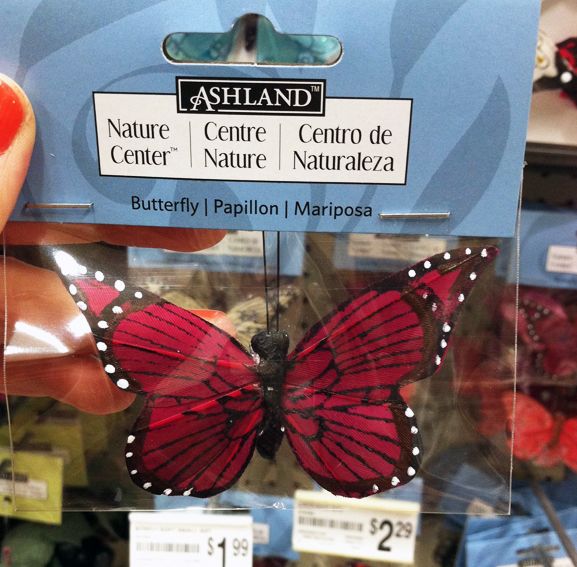
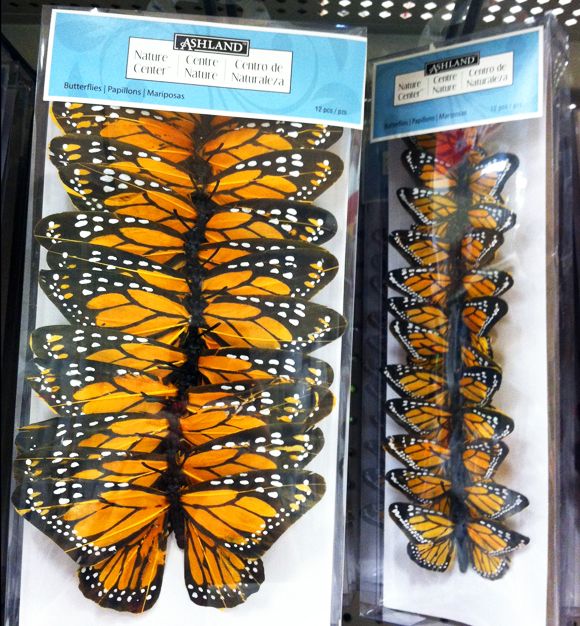
Recently I was at Michael's picking up some frames for a project and I spied a whole section of faux butterflies that were actually quite pretty! I think a framed collection of these would be adorable in any room, but especially in a nursery or a play room.


Not the real deal, but still pretty, right? Before any coupons, they were priced at about $1-$2 each, which is a steal.

And why not try a unique arrangement pattern (like with these) to mix things up a little?

Monday, January 21, 2013

Powder Bath Updates

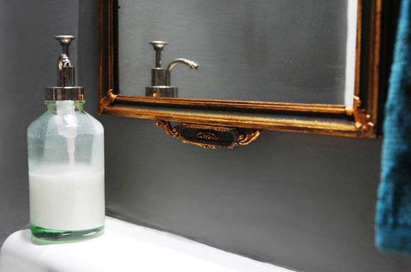
I have been looking for a new mirror for our powder bath for a while (you can see the super boring, plastic(!) old mirror here). The corner sink is so teeny that the dimensions of the new mirror needed to be pretty specific, and the frame had to be thin. It's hard to find a thin and interesting frame!
I found this antique beauty at Center Stage antiques in New Jersey (a fun place to stop by for furniture and mirrors if you're in the area) and it spurred a very spontaneous change of wall color.  Remember the DIY abstract walls here? I still liked the walls (they were really fun in person), but this mirror needed a more moody backdrop.

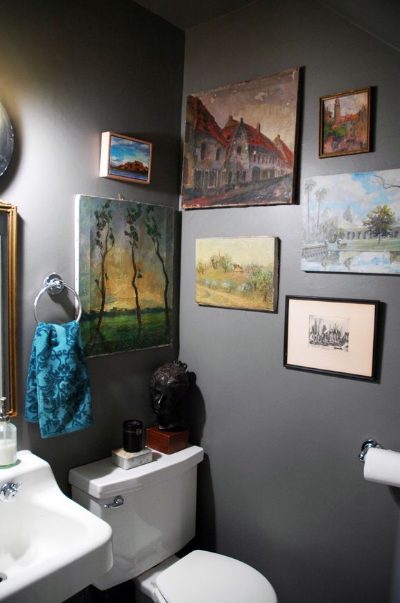
The new color is one of my stand-by favorites - Benjamin Moore's Chelsea Gray. It's dark, but not too dark.


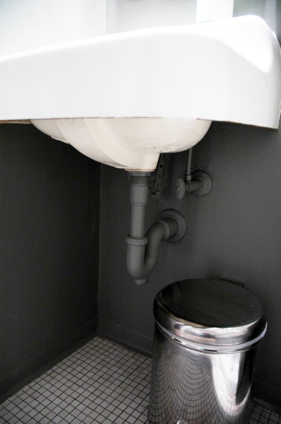
And rather than going for a skirt on the sink like I thought I would, I just put a new coat of paint on the pipes so they sort of blend into the wall more. I love how industrial (and clean!) it looks compared to before.


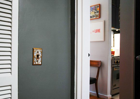
I kept the bi-fold doors white for now for some lightness in the space. That old mother of pearl and brass light switch cover from Anthropologie came alive on the dark gray walls! It's been one of my favorites over the years. I think we've had this cover in five homes now?


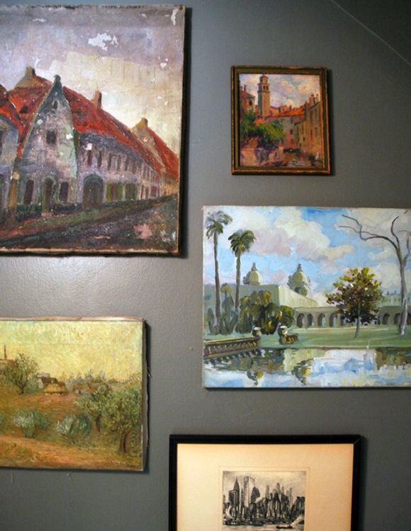
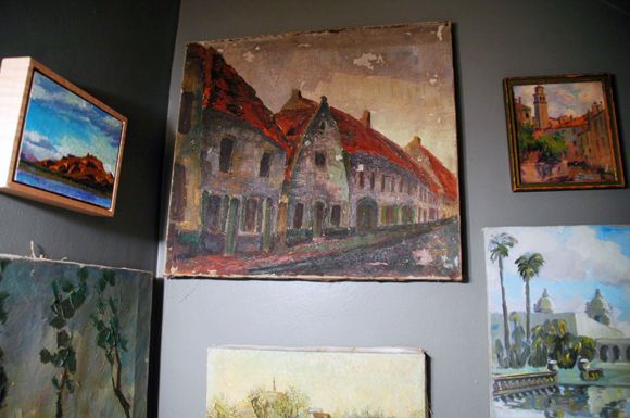
I kept the old art hanging in the same places. These are all paintings (most of them really old) of my favorite places. I bought most of them in flea markets of the places they depict (Venice, Rome, Brussels, Bruges, and of course the Seaport etching.)


Most of them are unframed and a little ragged, but I think I like them best this way!


How was your weekend? Did you watch the inauguration?